How I built vibe.nfrancois.fr with Claude Code
An abandoned Supabase hub, three design directions, a shared CSS foundation, and a brand guide written before redesigning: the story behind vibe.nfrancois.fr.
Work log written with Claude from my notes, then reviewed and approved. Translated from French.
Since October 2026, vibe.nfrancois.fr has lived on as the Lab on nfrancois.fr. This entry describes the site as it was then.
The starting point
I wanted a place to show the tools I build with AI, at an address of my own: vibe.nfrancois.fr. The site was built with Claude Code, in cloud sessions, from the first line to the animated logo. Above all, it changed direction several times before it found its shape. This entry covers both: the technical side, and the false starts.
The stack
- Next.js 14 (App Router), fully static pages, hosted on Vercel.
- CSS without a framework. Tailwind was removed along the way.
- Geist and Geist Mono, self-hosted, and Phosphor icons copied as is.
- Claude Code in a cloud session, with Chromium and Playwright to check every change.
- Markdown, Shiki, and unified for the notebook, since October 12.
The steps
September 29: the hub that took a wrong turn
The first version was ambitious: a project catalog on Supabase, with sign-in, private projects, guests, private pages, and publishing rules. In 45 minutes, Claude Code had set up the Next.js project, the Supabase migrations, and the Vercel functions in Paris, close to the database.
Twelve days later, reading it over, I wrote: “I think this project is on the wrong track. I’d just like a page that lists my vibe coding projects.” The hub was cut down to a single static page. Only the Supabase database survived, for an event’s interactive workshop.
October 11 and 12: three design directions
Once the page was down to the essentials, I looked for its style. Three directions followed one another in two days:
- The nfrancois.fr brand guide, light, then a “premium” dark version. In the end, I wanted something that looked more like a tech site.
- A “developer tool” look, in the style of Vercel, Supabase, or Neon: an almost black background, one-pixel rules, a fading grid, and a single bright color. That’s where the shared foundation was born.
- Lime, with light mode as the default, after writing a brand guide (see below).
The shared foundation
The most useful technical choice in the project: a single CSS file, /kit/vibe.css, shared by the home page and by every project. It holds the colors, the fonts, and the components prefixed v- (buttons, pills, navigation bar, footer). A small script, /kit/theme.js, applies the light or dark theme before the page renders and remembers the choice across the whole site.
A project like Impact IA stays a standalone HTML file. It simply loads the foundation and keeps its own colors.
A design system that reads its own CSS
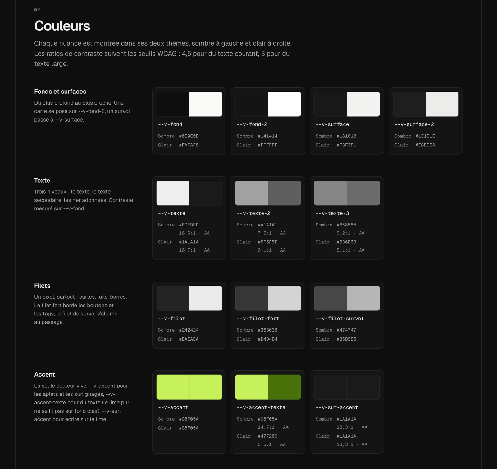
The design system, at /design-system (a vibe page, archived here), shows every color in both themes with its contrast ratio. Instead of copying the values, the page reads them from vibe.css at build time:
export function kitTokens() {
  const css = fs.readFileSync(path.join(process.cwd(), 'public/kit/vibe.css'), 'utf8');
  const light = vars(block(css, ':root {'));
  const dark = { ...light, ...vars(block(css, ':root[data-theme="dark"] {')) };
  return (names: string[]) => names.map((n) => ({ name: n, dark: dark[n] ?? '', light: light[n] ?? '' }));
}
Changing a color in the foundation is enough to update the page. This check also revealed a flaw: the gray used for metadata had a contrast of only 3.9:1 in dark mode. It was raised to pass 4.5:1 everywhere.
Writing a brand guide before redesigning
After the second direction, I wrote a new brief, with mockups in lime. Rather than start a third redesign, I asked Claude to ask me questions one by one: who the site is for, what sets it apart from my professional site and my newsletter, what content, what pace, what identity.
Twelve questions later, the brand guide fit on one page in CLAUDE.md, the file Claude Code reads at the start of every session. It locks in the choices and adds a freeze rule: no more redesigns until five pieces of content are published.
The logo: vectorizing without redrawing
The logo is a hand drawing. To turn it into a vector without betraying it, Claude Code traced it automatically with potrace. It then compared the result with the original image by overlaying them. Only two touch-ups: a bump removed at the foot of the “b,” and the dot of the “i” recentered over its stem.
To animate it, the logo had to “write itself.” Since it’s made of filled shapes, its outline can’t be drawn. The solution: one mask per pen stroke, a thick invisible line that follows the skeleton of the letters and reveals the drawing as it goes.
.vibe--anime .vibe__g0 { animation: vibe-trace .32s cubic-bezier(.45, 0, .55, 1) .05s backwards; }
@keyframes vibe-trace { from { stroke-dashoffset: 1; } }
What went wrong
- Masks that were too wide. A single stroke per letter made pieces of the next letter appear mid-animation. The “b” had to be split (stem, then bowl) and the “e” too (bar, then loop), and each letter limited to its own area by a path that follows the white space between them.
- Production following an old branch. Vercel was building production from the branch of the very first session. For a while, every change was pushed to two branches.
- A local server that kept serving the old CSS.
next startdidn’t serve files inpublic/changed after it started. It had to be restarted every time. - A
<style>in an inlined SVG applies to the whole page. So the notebook’s diagrams only usestyleattributes, and the build rejects anything else.
Time and costs
- Three work sessions: the evening of September 29, the evening of October 11, then October 12. In total, 36 commits as of this entry.
- A Claude Max subscription, hosting on Vercel. No other paid service for the site.
Takeaways
- Write the brand guide before designing. Three design directions in two days is a sign that a decision was missing upstream, not that a better design was needed.
- A shared foundation pays off right away. The switch from yellow to lime only took changing a few variables, and Impact followed without being touched.
- Have Claude check in a real browser. Playwright screenshots, on desktop and mobile, in light and dark mode, found flaws no code review would have caught.
- Keep a decision log.
CLAUDE.mdkeeps you from rehashing the same debates from one session to the next.